


אהלן!
עלה לי הצורך ליצור תוכן עניינים דביק שרספונסיבי גם לנייד.
הקוד מתחלק ל-3 חלקים: HTML, CSS, JS
HTML
ה-HTML מתחלק לשני תגיות: Button & dialog. הכפתור פותח את התגית dialog בעזרת ג'אווה סקריפט, בתוך התגית dialog יש כותרת H2 של "תוכן עניינים", פסקה ריקה וכפתור סגירה. הפסקה הריקה תתמלא על ידי ג'אווה סקריפט עם תגיות לינק בצורה אוטומטית.
כך זה יראה:
<button class="sticky-toc open-button" title="לחצו לפתיחת תוכן עניינים"></button>
<dialog class="modal" id="modal">
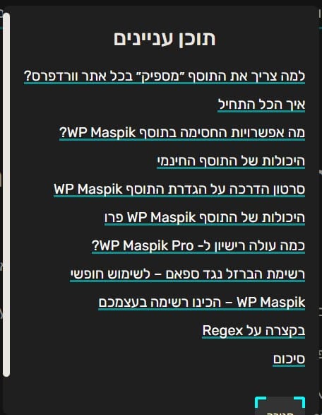
<h2>תוכן עניינים</h2>
<p></p>
<button title="לחצו לסגירת תוכן עניינים" class="close-button">סגירה
</button>
</dialog>
Code language: HTML, XML (xml)CSS
ה-CSS מתחלק ל:
אייקון מקודד, עם רקע עגול שנמצא בצד התחתון שמאלי של המסך (אפשר גם להעביר לימין)
עיצוב פוקוס על האייקון
עיצוב החלונית פופ-אפ שנפתחה של תגית dialog והתגיות הפנימיות.
.sticky-toc {
position: fixed;
bottom: 15px;
left: 15px;
border-radius: 50%;
background-color:#1F1F1F;
width: auto;
height: auto;
padding: 4px;
opacity: 1;
z-index: 9999;
}

.sticky-toc:before {
content: '';
position: relative;
background-image:url('data:image/svg+xml,%3Csvg xmlns="http%3A%2F%2Fwww.w3.org%2F2000%2Fsvg" width="20px" height="20px" preserveAspectRatio="xMidYMid meet" viewBox="0 0 24 24"%3E%3Cpath fill="white" d="M3 9h14V7H3v2m0 4h14v-2H3v2m0 4h14v-2H3v2m16 0h2v-2h-2v2m0-10v2h2V7h-2m0 6h2v-2h-2v2Z"%2F%3E%3C%2Fsvg%3E');
background-repeat: no-repeat;
background-position: center;
background-size: 25px;
border-radius:50% 0 0 50%;
padding: 12px;
color:#fff;
}

.sticky-toc:is(:hover,:focus) {
background-color: hsl(0, 100%, 10%);
outline: 4px dashed aqua;
outline-offset: 0.175rem;
color: #1F1F1F;
}

dialog {
padding: 1em;
max-width: 50ch;
border: 0;
color:#1F1F1F;
background-color:#E9E6E1;
border-radius:10px;
}

dialog::backdrop {
background: rgb(0 0 0 / 0.4);
}

dialog h2 {
    text-align: center;
    margin-top: 0.5rem;
}

dialog p a {
    line-height: 2;
}
Code language: CSS (css)
תגיות הלינק והכפתור לא מעוצבות, הן ישאבו את העיצוב מהאתר שלכם, אם אין לכם עיצוב של כפתור או לינק, ניתן לעצב דרך הגדרות אתר באלמנטור או בעזרת CSS.
שימו לב: בחלק מהמקומות תצטרכו להתאים לצבעים של הפרויקט שלכם. השתמשתי בקוד ב- CSS Variables, לנוחות החלפתי את ה-CSS לצבעים פשוטים ועל אחריותכם להחליף את הצבעים בהתאמה לאתרכם.
Javascript
הג'אווה סקריפט מייתר ומחפש את כל הכותרות תחת הקלאס שתגדירו. בברירת מחדל מוגדר הקלאס של כל התוכן פוסט שנמצא בפוסטים של אלמנטור .elementor-widget-theme-post-content הקוד שואב את הכותרות ומוסיף להם ID ייחודי לכותרת על מנת שיהיה אפשר להגיע אל הכותרת בעזרת קישור עוגן.
שימו לב: אם לכותרות שלכם יש ID ייחודי – הקוד ידרוס אותו!
הקוד מאפשר סגירה התגית dialog בכמה דרכים:
- לחיצה מחוץ לקופסאת הפופ-אפ
- לחיצה על מקש Esc
- לחיצה על כפתור סגירה
- לחיצה על כל קישור יסגור את הפופ-אפ ויעביר לאזור התוכן.
הקוד:
const modal = document.querySelector("#modal");
const modalContent = modal.querySelector("p"); // leave 1 p tag empty
const openModal = document.querySelector(".open-button");
const closeModal = document.querySelector(".close-button");

openModal.addEventListener("click", () => {
  modal.showModal();
});

closeModal.addEventListener("click", () => {
  modal.close();
});

window.onmousedown = function (event) {
  if (event.target == modal) {
    modal.close();
  }
};

document.addEventListener("DOMContentLoaded", function () {
  const body = document.querySelector(".elementor-widget-theme-post-content"); // The Content area. Change ".elementor-widget-theme-post-content" to .class-name
  const headings = body.querySelectorAll("h2, h3, h4, h5, h6");

  for (var i = 0; i < headings.length; i++) {
    headings[i].setAttribute("id", "toc-anchor--" + i);
    br = document.createElement("br");
    if (i > 0) modalContent.appendChild(br);
    row = document.createElement("a");
    row.setAttribute("href", "#toc-anchor--" + i);
    row.innerText = headings[i].innerText;
    modalContent.appendChild(row);
    row.addEventListener("click", () => {
  modal.close();
});
  }
  },
  false
);
Code language: JavaScript (javascript)
תודה לתום תובל על העזרה עם ה-JS!
הקוד הסופי:
את הקוד הסופי ניתן להטמיע בתבנית פוסט באלמנטור > בתוך ווידג'ט HTML שיאגד את הHTML &- JS ולכתוב את כל העיצוב ב-CSS במותאם אישית.
<button class="sticky-toc open-button" title="לחצו לפתיחת תוכן עניינים"></button>

<dialog class="modal" id="modal">
  <h2>תוכן עניינים</h2>
  <p></p>
  <button title="לחצו לסגירת תוכן עניינים" class="close-button">סגירה
</button>
</dialog>

<script>
const modal = document.querySelector("#modal");
const modalContent = modal.querySelector("p"); // leave 1 p tag empty
const openModal = document.querySelector(".open-button");
const closeModal = document.querySelector(".close-button");

openModal.addEventListener("click", () => {
  modal.showModal();
});

closeModal.addEventListener("click", () => {
  modal.close();
});

window.onmousedown = function (event) {
  if (event.target == modal) {
    modal.close();
  }
};

document.addEventListener("DOMContentLoaded", function () {
  const body = document.querySelector(".elementor-widget-theme-post-content"); // The Content area. Change ".elementor-widget-theme-post-content" to .class-name
  const headings = body.querySelectorAll("h2, h3, h4, h5, h6");

  for (var i = 0; i < headings.length; i++) {
    headings[i].setAttribute("id", "toc-anchor--" + i);
    br = document.createElement("br");
    if (i > 0) modalContent.appendChild(br);
    row = document.createElement("a");
    row.setAttribute("href", "#toc-anchor--" + i);
    row.innerText = headings[i].innerText;
    modalContent.appendChild(row);
    row.addEventListener("click", () => {
  modal.close();
});
  }
  },
  false
);
</script>
Code language: HTML, XML (xml)
ואת ה-CSS אמליץ לשים בתור Custom Code ברמת תבנית הפוסט או ברמת הווידג'ט HTML
בונוס:
עיצוב סלקטור :target שנותן לעצב את התוכן עוגן שמגיע ב-HTML
:target {
  border: 2px solid #D4D4D4;
  background-color: #e5eecc;
}Code language: CSS (css)
Happy Debugging!


